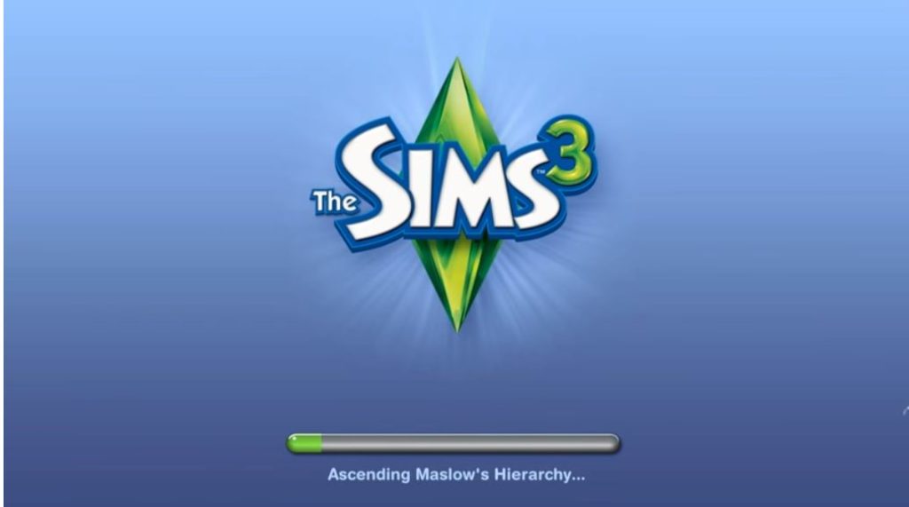
One of the things I loved about the old The Sims games from Maxis was their sense of humor. Their loading screens were full of little in-jokes, for example, with little snippets of text explaining nonsensical things that the computer was doing to get your game ready. Things like “Chlorinating carpools” or “Calculating money supply” or, most famously, “Reticulating splines.” I always thought these things were just a way to make the tedious loading process a little more bearable, and I’m sure that’s what Maxis intended. But some recent research on the psychology of waiting suggests that game designers might want to take some serious advice from this silly practice.

This line of thought started for me when a reader 1 linked me to an episode of 99 Percent Invisible that deals with the design of websites, apps, and other interfaces where users typically have to sit and wait for something to happen. Everything ranging from the little hourglass mouse icon to progress bars to reticulating splines. One of the researchers that the episode focused on was Ryan Buell of the Harvard Business School. He has done a lot of research on an idea called “operational transparency.”
The idea is pretty simple: show people what’s taking so long and they’ll be more satisfied with the experience. Sometimes they may be even more satisfied despite a longer wait.
As one example, Buell and his colleagues ran an experiment where they created two versions of a travel website.2 You know the kind, where you ask for the site to search for different airfares, hotels, and rental cars before returning a list of your best options. It’s a time-consuming task even for computers on a fat internet connection, so users typically have to sit there, drum their fingers, and wait. The researchers had one group of subjects use a version of the site with just a standard progress bar that filled up as the site worked. But another group got to see text describing the work the site was doing as it canvassed various airlines. When asked, subjects said that they considered this second version of the website to be more valuable no matter how long they had to wait. Somebody in this condition who waited for 55 seconds liked the experience more than someone who got a bland progress bar that delivered results in only 25 seconds.
Man, the human mind is weird.

Buell has continued his research into operational transparency and you can find the fruits of that research in a fascinating variety of applications. Some ATM machines 3 show animations of the money being counted and sorted. Some fast-food drive-throughs have replaced intercoms with video screens. And, of course, there’s the Domino’s Pizza Tracker that lets you watch your dinner go through its various stages of being assembled, cooked, and delivered. In every case, you get more information about what’s happening than you’d get from a timer or progress bar.
The point is that conventional wisdom may tell you to make the process of making something or doing something <i>seem</i> as effortless as possible. It makes sense to want to hide the details from users so that they can’t scrutinize what’s going on. But users may appreciate seeing some of the work and it may make them more understanding and more willing to wait.
Maxis’s loading screens with their parade of obviously fake tasks probably isn’t exactly what game developers want to do, but it may nonetheless provide the shape of a good approach for developers to experiment with. What if you put up lists of things that the game was calculating, loading, or handling during a loading process? What if your matchmaking screen displayed a count of how many potential opponents it had combed through in its quest to find you a good match? Players might be more happy to wait.


But….. its redundant
If the game is very well done, then loading a level is just one load of data from disk to ram, so the “extra info” is like a download bar.